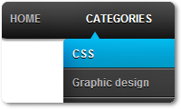
In this Tutorial I'm gonna show you how to add your website or blog a CSS Drop down menu with no Java or jQuery Script. There are no images used and, as usual, minimal HTML markup. The dropdown menu is really attracting and you may love it.This is one of my favorite drop down menu.
Let’s see how it was made:
How To Add CSS3 Drop Down Menu In Blogger
- As Usual Go to Blogger dash Board > Layout > Add a Gadget
- Then From menu of Add Gadget Choose HTML/Java Script
- Now Paste the Below Code in it
<style>
#menu
{
width: 100%;
margin: 0;
padding: 10px 0 0 0;
list-style: none;
background: #A6A9A6;
background: -moz-linear-gradient(#444, #A6A9A6);
background: -webkit-gradient(linear,left bottom,left top,color-stop(0, #6F7575),color-stop(1, #444));
background: -webkit-linear-gradient(#444, #A6A9A6);
background: -o-linear-gradient(#444, #A6A9A6);
background: -ms-linear-gradient(#444, #A6A9A6);
background: linear-gradient(#444, #A6A9A6);
-moz-border-radius: 50px;
border-radius: 50px;
-moz-box-shadow: 0 2px 1px #9c9c9c;
-webkit-box-shadow: 0 2px 1px #9c9c9c;
box-shadow: 0 2px 1px #9c9c9c;
}
#menu li
{
float: left;
padding: 0 0 10px 0;
position: relative;
line-height: 0;
}
#menu a
{
float: left;
height: 25px;
padding: 0 25px;
color: #999;
text-transform: uppercase;
font: bold 12px/25px Arial, Helvetica;
text-decoration: none;
text-shadow: 0 1px 0 #000;
}
#menu li:hover > a
{
color: #fafafa;
}
*html #menu li a:hover /* IE6 */
{
color: #fafafa;
}
#menu li:hover > ul
{
display: block;
}
#menu ul
{
list-style: none;
margin: 0;
padding: 0;
display: none;
position: absolute;
top: 35px;
left: 0;
z-index: 99999;
background: #444;
background: -moz-linear-gradient(#444, #A6A9A6);
background: -webkit-gradient(linear,left bottom,left top,color-stop(0, #A6A9A6),color-stop(1, #444));
background: -webkit-linear-gradient(#444, #A6A9A6);
background: -o-linear-gradient(#444, #A6A9A6);
background: -ms-linear-gradient(#444, #A6A9A6);
background: linear-gradient(#444, #A6A9A6);
-moz-box-shadow: 0 0 2px rgba(255,255,255,.5);
-webkit-box-shadow: 0 0 2px rgba(255,255,255,.5);
box-shadow: 0 0 2px rgba(255,255,255,.5);
-moz-border-radius: 5px;
border-radius: 5px;
}
#menu ul ul
{
top: 0;
left: 150px;
}
#menu ul li
{
float: none;
margin: 0;
padding: 0;
display: block;
-moz-box-shadow: 0 1px 0 #6F7575, 0 2px 0 #777777;
-webkit-box-shadow: 0 1px 0 #A6A9A6, 0 2px 0 #777777;
box-shadow: 0 1px 0 #6F7575, 0 2px 0 #777777;
}
#menu ul li:last-child
{
-moz-box-shadow: none;
-webkit-box-shadow: none;
box-shadow: none;
}
#menu ul a
{
padding: 10px;
height: 10px;
width: 130px;
height: auto;
line-height: 1;
display: block;
white-space: nowrap;
float: none;
text-transform: none;
}
*html #menu ul a /* IE6 */
{
height: 10px;
}
*:first-child+html #menu ul a /* IE7 */
{
height: 10px;
}
#menu ul a:hover
{
background: #0186ba;
background: -moz-linear-gradient(#04acec, #0186ba);
background: -webkit-gradient(linear, left top, left bottom, from(#04acec), to(#0186ba));
background: -webkit-linear-gradient(#04acec, #0186ba);
background: -o-linear-gradient(#04acec, #0186ba);
background: -ms-linear-gradient(#04acec, #0186ba);
background: linear-gradient(#04acec, #0186ba);
}
#menu ul li:first-child > a
{
-moz-border-radius: 5px 5px 0 0;
border-radius: 5px 5px 0 0;
}
#menu ul li:first-child > a:after
{
content: '';
position: absolute;
left: 30px;
top: -8px;
width: 0;
height: 0;
border-left: 5px solid transparent;
border-right: 5px solid transparent;
border-bottom: 8px solid #444;
}
#menu ul ul li:first-child a:after
{
left: -8px;
top: 12px;
width: 0;
height: 0;
border-left: 0;
border-bottom: 5px solid transparent;
border-top: 5px solid transparent;
border-right: 8px solid #444;
}
#menu ul li:first-child a:hover:after
{
border-bottom-color: #04acec;
}
#menu ul ul li:first-child a:hover:after
{
border-right-color: #04acec;
border-bottom-color: transparent;
}
#menu ul li:last-child > a
{
-moz-border-radius: 0 0 5px 5px;
border-radius: 0 0 5px 5px;
}
#menu:after
{
visibility: hidden;
display: block;
font-size: 0;
content: " ";
clear: both;
height: 0;
}
* html #menu { zoom: 1; } /* IE6 */
*:first-child+html #menu { zoom: 1; } /* IE7 */
</style>
<ul id="menu">
<li><a href="#">Home</a></li>
<li><a href="#">Categories</a>
<ul>
<li><a href="#">CSS</a></li>
<li><a href="#">Graphic design</a></li>
<li><a href="#">Development tools</a></li>
<li><a href="#">Web design</a></li>
</ul>
</li>
<li><a href="#">Work</a></li>
<li><a href="#">About</a></li>
<li><a href="#">Contact</a></li>
</ul>
Now Replace the Bolded Text with your Desired Tab Titles
Then Replace the # with your Urls, and place your gadget on the page where you like and Hit the Save the Arrangement.
My Job is Done here and please be charity and Donate to our Blog.


 Hi! I am Dulshan, a Pro Blogger, an E-money Guider for the those who need. I have created Blogrithm and currently runs it. Helping to the People who struggle to make money from the Internet is the cause which motivate me in creating the Site.

0 comments:
Post a Comment